Barner Books Redesign

My Role:
UX/UI Designer
Duration:
1.5 Week Sprint
Tools:
Figma
Zoom
Google Workspace
Pen and Paper
Project Overview
I was tasked with the redesign of the website for Barner Books. Barner Books is a brick and mortar store that sells books as well as a variety of other items such as vintage typewriters, ephemera paper, Italian posters/wraps, and handmade journals.
The Design Process
Initially I went through the process of doing a general overview of the site as it was. Barner Books was really lacking in quite a few critical areas right off the bat. There were issues with repetition, alignment, proximity, and spacing throughout the entirety of the site. They had no global navigation of any sort. The only options were a categories page and an option to login. With this limited navigation, I held the assumption that most people, when wanting to shop with Barner Books, were not doing it online.
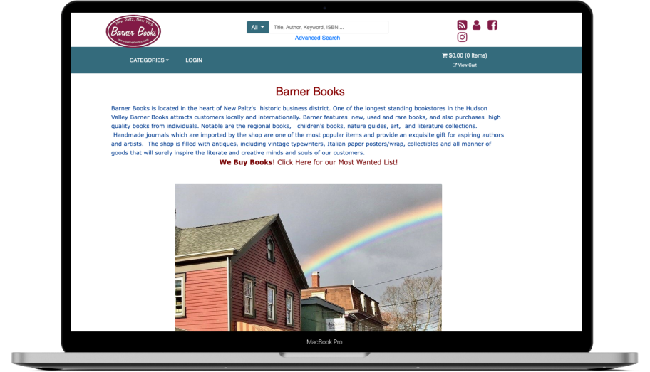
The category feature, a critical feature for an e-commerce site, while present in the primary navigation, only had a limited number of listings. For example, it only had the options for A-C available on the site. Nothing else. With that said, the preset categories were things like: Antiques, Architecture, Body, Mind, Spirit, Bookmarks, Care, Chess, Christian Religious. These topics are so specific, yet limited at the same time, and are combining bookish topics with physical objects. This will prove to be confusing and limiting for the user.
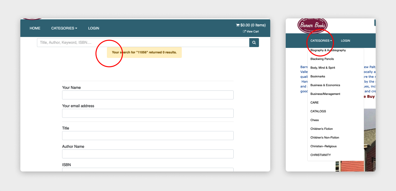
Following this initial assessment I did several generalized usability tests with 3 students and artists. I wanted to see how this site might function for the average user and I asked that they just attempt to add a specific item to the cart. The website essentially proved to be not usable, leaving the testers confused and stunned by the limitations. Barner Books was missing many of the standard elements that are on any website, let alone an e-commerce website.
The Insights
I then led with a Heuristics Evaluation that reflected the results of the usability tests findings.
A Heuristics Evaluation is a series of markers to measure the learnability, satisfaction, memorability, efficiency, and error management of a website. What I found was that Barner Books was hitting the highest severity in many categories that are important for an eCommerce site to function, and create traffic and revenue. Some of these things are as follows:

The Competition
When doing competitive and comparative analysis I really wanted to focus on the way users would be shopping through Calls To Action, as well as the checkout and purchasing process.
These are some of the places I chose to view these features.
When doing this analysis I measured through doing a taskflow for each of these websites. Each one excels in the areas listed above, where Barner Books does not. These are conventions that are the standard for facilitating the sale of goods or services. Each of these places has a quick and efficient checkout process, clear Calls To Action on the Landing Page, and most importantly a similar feel and vibe to how it feels to shop and have the in store experience.
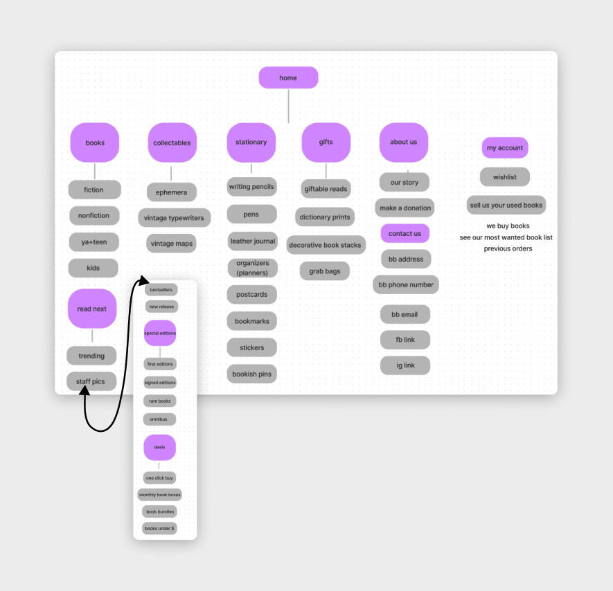
Card Sorting
I did a closed card sort in order to determine where I should categorize the unique inventory that Barner Books sells that were not listed on their website, but that are available for purchase in store. This cart sort enabled me to develop a more efficient shopping experience by having clear designated areas where products would be located. An example of the some feedback received: most users found a ‘Read Next’ tab as an independent option on the Global Navigation was unhelpful, and lacked clear understanding; users also enjoyed knowing a bit more about the store when shopping locally, indicating the need for a clear About page to create that local personal feel.

Persona and Problem Statement
Meet Chloe. The Gift Giver.


Ideation and Design
With this problem in mind I then moved into creating a userflow and sitemap.
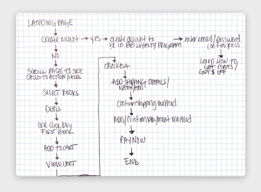

Sketches
Barner Books had a website that was quite outdated so there was a lot to build up and no elements that I could retain. This was going to be a complete overhaul! I really needed to figure out what are the best elements that make for an effective and inviting bookshop experience while still retaining what I know about the storefront brand. As well the ability to shop for unique gifts and see clear descriptions on a mobile site.
One of the things I was unsure about at this sketching stage was even where to begin. So I starting with a design studio. This resulted in some rough sketches but really gave me some direction.

I went through iteration of these sketches to see what version might incorporate the most viable features.
Wireframes
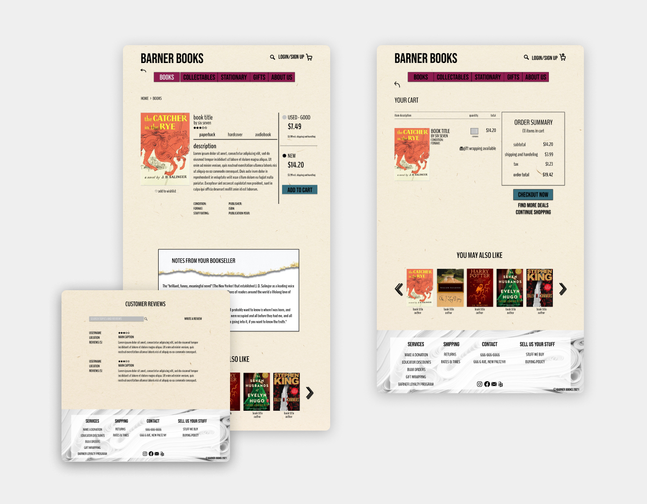
I then moved to rough grayscale wireframes. This helped me really get a clear and tangible idea of what I was aiming for. Some ideas and concepts I had at this stage was, notes from the staff (local) bookseller, and images of books on the Landing Page or Home Page.

Usability Testing
I conducted usability testing with a different set of 3 students and artists, here is how that went.


The metrics that I used for these usability tests are as follows:

Some Insights + Findings


Errors:


High Fidelity
Upon moving to high fidelity and running several more tests, I found that users still could not complete one of the tasks, which was looking for something specific for teens. I needed to make sure the Adult, YA & Teen distinction was clearly distinguishable.

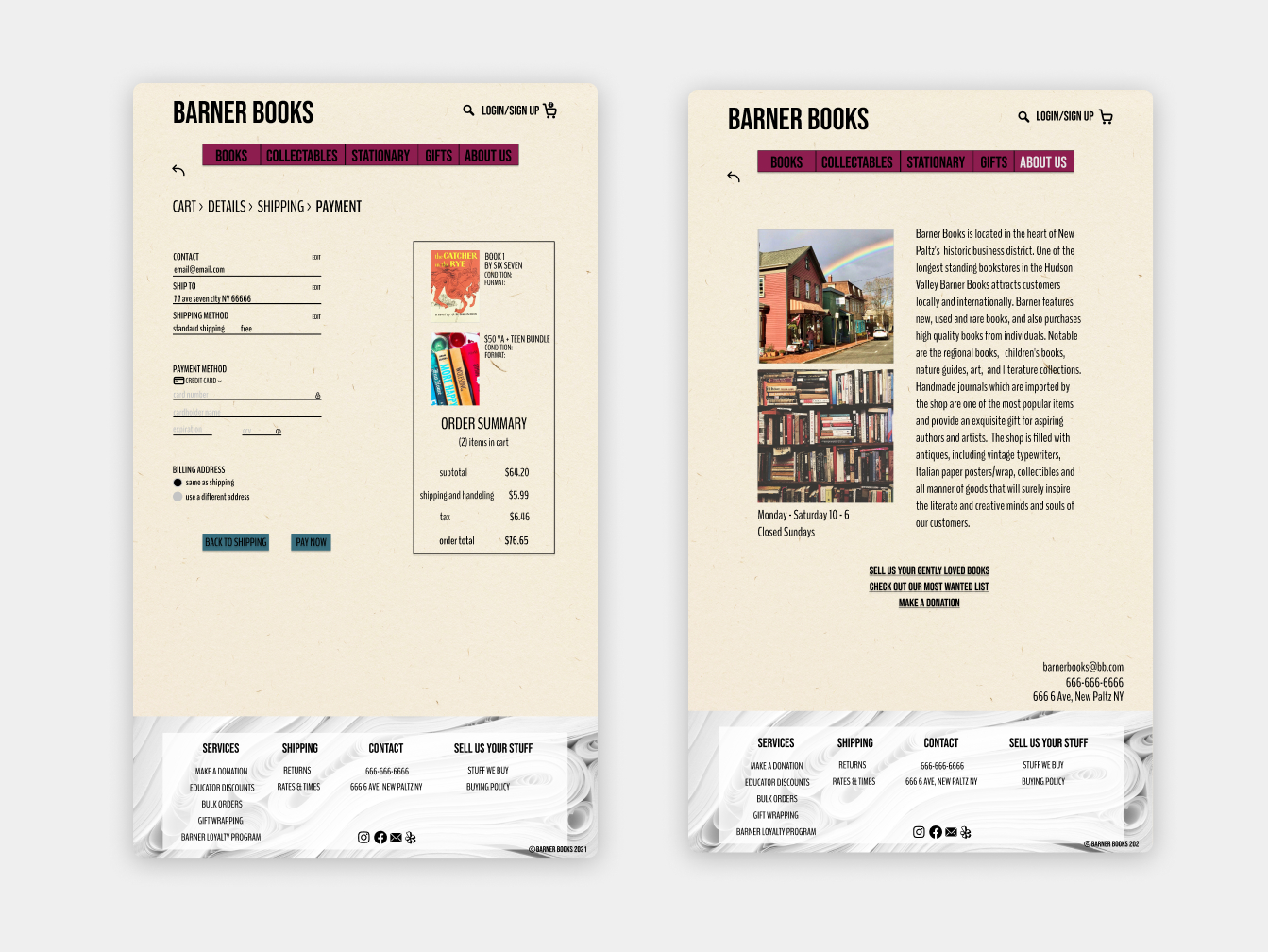
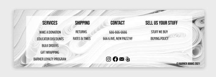
Something else I changed in hi-fi was the footer having a white overlay. I found issues with accessibility regarding the black font over the image of white paper. By introducing a slightly opaque white overlay in between the image and the text it allowed the image to be visible and the text readable.
Next Steps
- Continue to iterate after more hi-fi usability testing
- Continue working on other UI elements, like a carousel, and functional drop down menus
- Chloe wants a mobile app!
- Consider mobile iterations that allow Chloe to see quickly what books Barner Books are willing to buy
Prototype Walk-Through
Selected Works
Daily UI Challengedaily UI
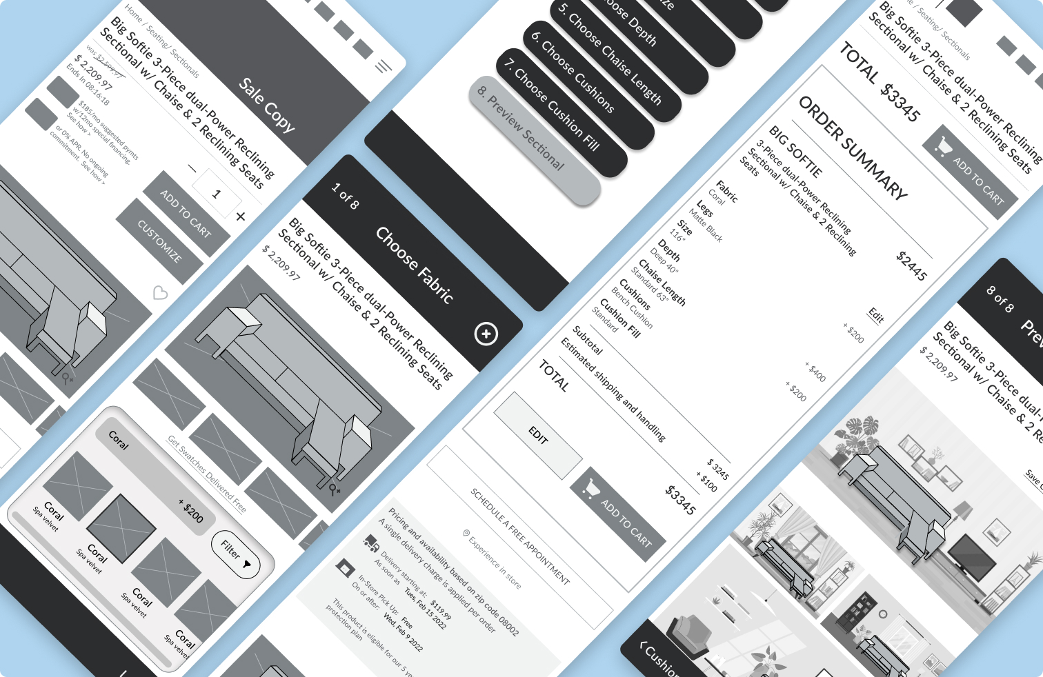
Blueporte-commerce project configurator
Barner Bookse-commerce redesign
The Emily Shane Foundationwebsite redesign research
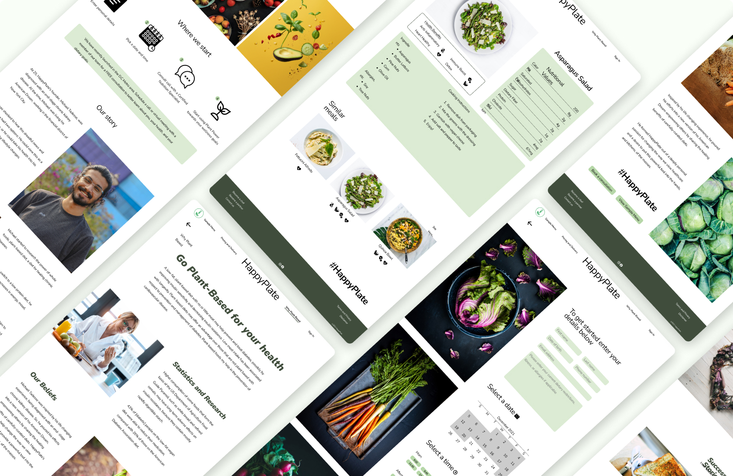
HappyPlatewebsite redesign