Blueport Product Configurator
The Team:
Zephyr Maverick (me)
Renee Hoffman
Joel Hoyt
Jasmine Vaterlaus
My Role:
UX/UI Designer
UX Researcher
Duration:
3 Week Sprint
Tools:
Figma & FigJam
Zoom
Google Workspace
Pen and Paper
Project Overview
The Company
Blueport is “the e-commerce platform for the rest of retail.” They have a cloud platform that provides e-commerce services for big ticket item retailers. So that would be things like furniture as opposed to something that's a smaller ticket item like buying a piece of clothing, and that has very different challenges to other types of retail. Their current clients include American Signature Furniture and the mattress retailer Steinhafels, and their platform really helps their clients build the omnichannel experience. So for big ticket items, a customer might first see something in store, then online, then maybe even go back to the store before finally purchasing online so their platform really helps direct the user through that omnichannel experience.
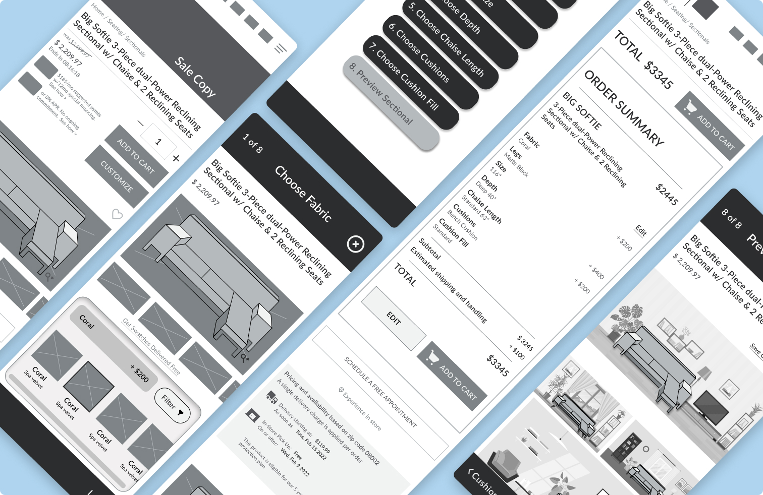
I was part of a four person design team tasked with the research and design of a product configurator for mobile that will support configuration of a variety of furniture items.
The Design Process
To start with, we were really first left to consider what exactly is a product configurator?
We really dove into researching just that and we found a couple examples of product configurators in the wild.
A few common characteristics of product configurators:
- You can typically choose a variety of customization options in a modular way that allows you to build something to your exact specifications
- These options will live update typically within a 3D rendering on screen so you can see everything happening as soon as you do it
- Finally, the price will often live update as well so the users are accurately informed about the price of the changes they're making
The Research
Blueport had already identified some competitors for us so we set about researching our competitors' websites to see whether or not they're currently using product configurators. And if not, what are they doing and if so, what did other configurators look like? We were surprised to see that a lot of the competitors are not currently using what we would call product configurators.
You can see here an image from the product page from Wayfair. You can customize the color of the sofa, but we wouldn't call it a configurator because you can only customize that one option and when you click on a different color, it will just update to a new image entirely of that sofa in a different color. Having multiple clear ways of locating specific products:
Whereas here with Burrow, another one of our competitors, it's kind of a modular setup where you can update several different aspects including fabric color, leg finish, arm style, and have it all live update within this nice 3D rendering right there within the same page.
The Challenge
Lots of Questions
It was at this point in the process, just a few days after being given this project, that I really felt like myself and my team kept trying different sketches, iterations, and different explorations to get a better understanding of what really makes each product configurator unique. What might be the obvious differences between these websites' exploration of them and how the specific item that is being sold affects what elements are able to be utilized in a product configurator?
Initially, we were a little stuck on the question of how complicated it could be. We thought about it and it seemed at once ridiculously complicated and deceptively simple. So we were trying to really get at what we can do here as designers. A lot of the complications appeared to be on the development side of things, in terms of programming the different types of rules and restrictions that it takes to provide the combinations of configurations. We knew that we could just draw something in figma that looked like a good configurator. But how would we actually know whether it was a good design? How would we know whether it met the user's needs and who even is our user?
We set out to dig deeper and explore these questions. We started this process by familiarizing ourselves with some mobile configurators. So initially, we had been looking at them on the desktop because we all sit here at our desktops everyday. However we were tasked with the design of a mobile configurator so we had to check those out. We quickly realized that the biggest challenge, of course, is that horizontal space is limited. That can lead to over reliance on vertical space, which causes issues with scrolling where the user sees the product image, scrolls way down the page to do updates and has to scroll way back up to see the updates happen so they don't get that live update experience.
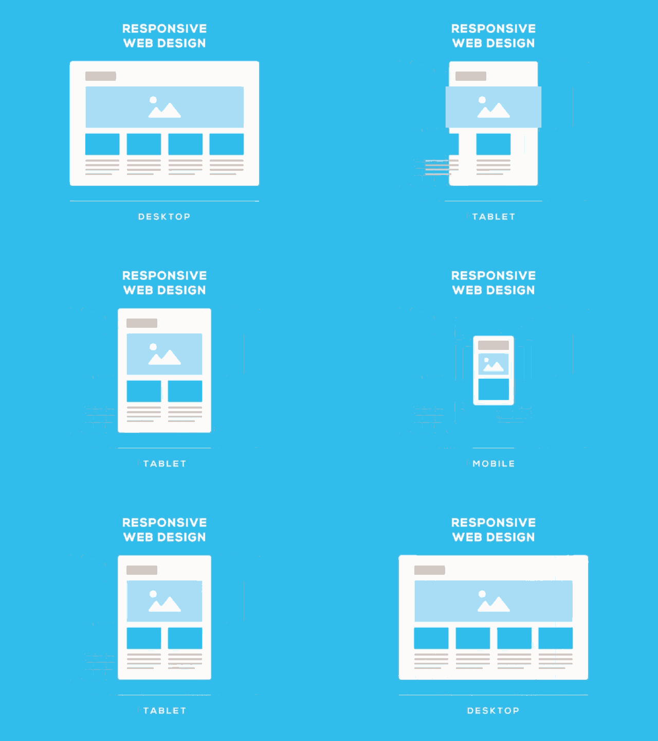
Looking into Android Material Design provided a much deeper understanding and inspiration of how to really leverage mobile design. We were particularly inspired by the container transform with the parent child transition as a way of showing a type of pop out or overlay that might allow us to keep a configurator tightly on one screen without too much scrolling while staying an overall part of the product page experience.

But we were still asking ourselves who is the user? Since so many different types of people buy furniture, it's hard to create super detailed personas. Blueport currently does not use personas, so we decided that we'd create proto personas that would help us define shopping behavior and motivation based on user interviews.
User Interviews and Proto Personas
Our main objective with user interviews was to understand consumer attitudes and motivations towards online shopping, and when users actually develop that caution towards the big ticket items.
We interviewed 6 consumers that typically shop online. Some of our main questions that we really focused on were:
Here are some of the direct quotes that we got after affinity mapping.
It is evident there are a lot of consistent trends and alot of them revolve around similar themes.
So with that we created four proto personas to really figure out what motivates the customer.
The Problem and How Might We
That then led us to defining the problem and one of the key insights that we gained is that product configurators are a really great opportunity for trust building with these companies and their users.
Exploring The Market
That led us into some usability testing of existing configurators. We did usability testing for two websites that already have existing configurators. Interior Define and Apartment 2B. We recruited using userinterviews.com and had six testers. Our team wanted to observe how users interact with product configurators and determine which factors influenced their satisfaction with the experience.
Figure 1
From the product details page of Interior Define users immediately enjoyed interacting with a 360 view feature and being able to see the product in multiple angles. These features help build confidence in users as it helps them fully examine the product. They even allow users to view their product using AR however.
Figure 1
Figure 2
For Apartment 2B 100% of users hated that they can only view this sectional from a top down view this certainly affected their buying confidence.
Figure 2
Figure 3
One notable feature of Apartment 2B that frustrated their users was its “tap to select and build features.” They all spent a few minutes trying to put the pieces together to create a sectional and one user was so frustrated that she was ready to quit the test right away had we not politely asked her to continue. Only 20% of our testers were able to figure this feature out.
Figure 3
Figure 4
For customizing colors Interior Define offered multiple selections coupled with name and material type. They even provide a filter option for users that want a pet or child friendly fabric. This wide variety was appreciated by the testers.
Figure 4
Figure 5
However for Apartment 2B, much to the users dismay, it only provided colors and no descriptions. As a product auto updates it appeared that there was a mismatch between the selected color and the one on the product. This again aggravated the user and built their distrust with this particular product configurator.
Figure 5
Figure 6
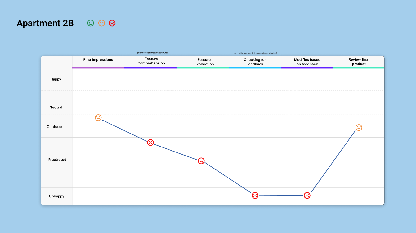
The next step for Apartment 2B is the review tab. 60% of our users got confused with the word review because they thought that they were going to see ratings from previous customers. It is actually a page where they can preview the sectional that they just built. Aside from only being able to see it from top down view at the bottom you will see an eye level view but at a tiny size. Again another cause of dissatisfaction from our users.
Figure 6
Figure 7
For Interior Define you will see that they offer several more options. 100% of our users had fun customizing and playing around with this feature. One user was quoted saying “it felt empowering,” interacting with this configurator and enjoyed that they also provided illustrations and explanations for some vague terms. All of these features mentioned delighted all of our users.
Figure 7
Figure 8
However, one thing they really didn't like is they had to always scroll upwards to check the changes that they made. As users go further in the process the image no longer appears on the screen.
Figure 8
Userflow
We did a userflow for both websites and these yellow diamonds from Interior Define all included the question: Did the user scroll back up to see the live updates? And yes, all of them did.
For Apartment 2B their “tap to select feature” was definitely a possible roadblock in keeping the users within the purchasing funnel.
Key Metrics
To synthesize our usability testing we rated the websites based on these metrics with one being poor and five being excellent.
Interior Define got a total of 41 whereas Apartment 2B only got 27. It's a super stark difference.
Journey Map
Our team also created a journey map to visualize the emotional journey of our testers.
As you can see, Interior Define clearly did a very satisfactory job in keeping their users happy:
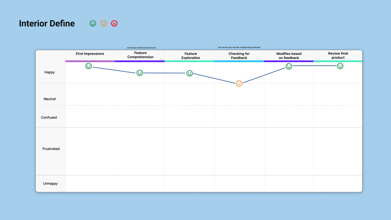
On the other hand for Apartment 2B this is the emotional journey of their users and they were clearly frustrated and unhappy interacting with the configurator:
Sketches
At this point, we were thinking how can we use the good points of Interior Define while eliminating the scrolling problem.
To start we just wanted to get a visual of our ideas. So we came together doing some sketches and did a design studio around them.
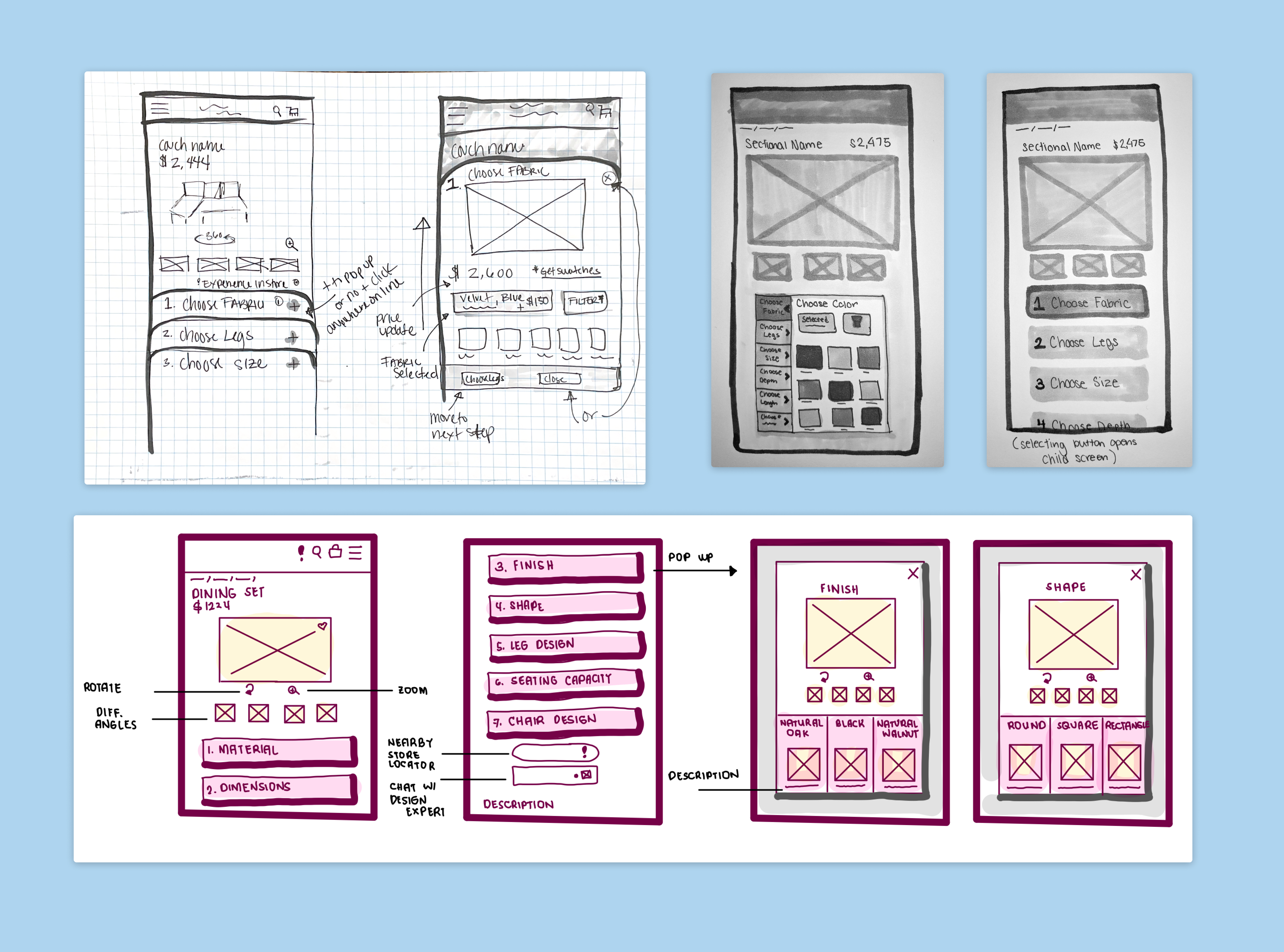
These are some of the elements that we liked:
- The numbered buttons helps the user visualize the process, know where they are and potentially skip around
- We liked the idea of having the process go through overlays
- The relative pricing and the position of the filter button
Wireframes
To start making our wireframes we traced over the American Signature product page in Figma. We did this because we knew that our configurator was going to be living on one of Blueports’ client pages, and we wanted to get a clear visual of how the integration of this element would affect an existing page.
I'll also mention at this point that we chose to design this for a sectional because sectionals tend to have the widest array of options for configuration and we figured we'd design the most ample configurator possible that could then be pared down for objects with less configuration possibility.
This is a quick look at the flow of our wireframes:
The user will start on the PDP page, click customize, and then move through the configuring process and the overlays get to preview the product at the end with lifestyle images of it like in a room and then they'll see the summary of their order on the last page.
Usability Testing
We then moved into usability testing of our prototype.
- Objective: Understanding user pain points in our current design
- Goal: Users will fully customize a sectional with three errors or less
- Scenario: You are shopping for a new sectional. You have not seen the sectional in-person.
- Task: Show me how you would go about modifying this sectional to your liking.
- Metrics:
• Ability to navigate through configurator
• Ease of variant selection
• Critical errors
• Minor errors
• Staying within funnel during configurator experience (number of clicks)
• Ease of overall use
Usability Testing Round 1

Changes made on round one:
- The customize buttons that showed the steps were embedded on the PDP page and people didn't see them sometimes
- We decided to add that as the first step of the overlay process through the configurator. So now people will see that right away
- We also added some lines to show the path of you moving through the steps
- People were a little confused by the breadcrumbs or would say one slash seven, so we changed that too. Instead it might be like “one of the last number"
- We made the exit (X) button larger because people didn't see it sometimes
- Then down at the bottom we would have the steps listed but people were confused by the number. Some people thought it meant there were two legs and not step one, step two, so we took out the number. And then on our last page, the Order Summary page. The summary was actually a little further down
Usability Testing Round 2
We moved on to testing round two with our new prototype, and we then noticed a couple of things:
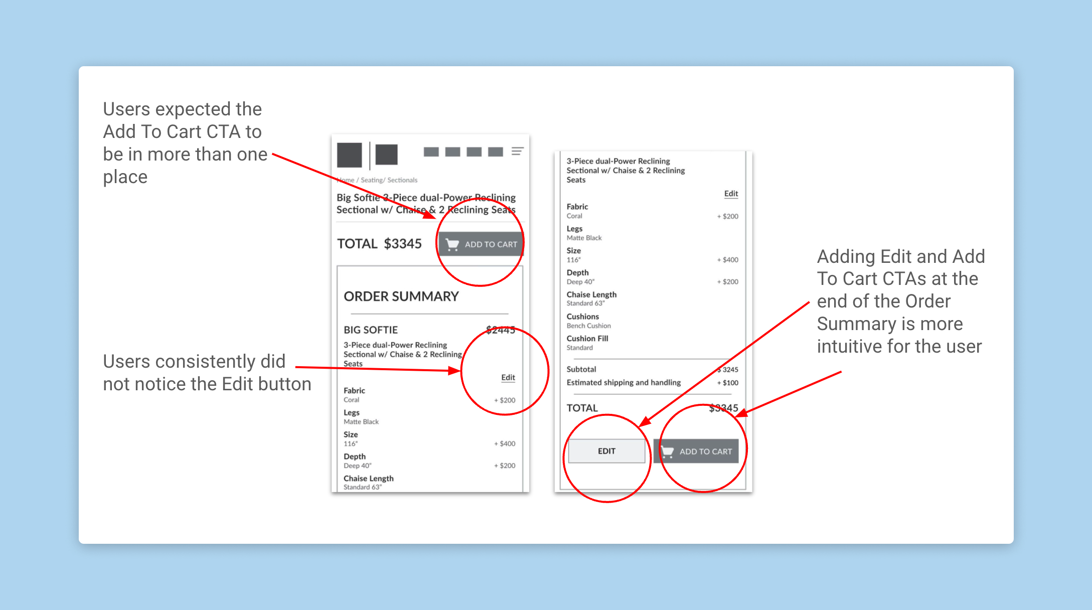
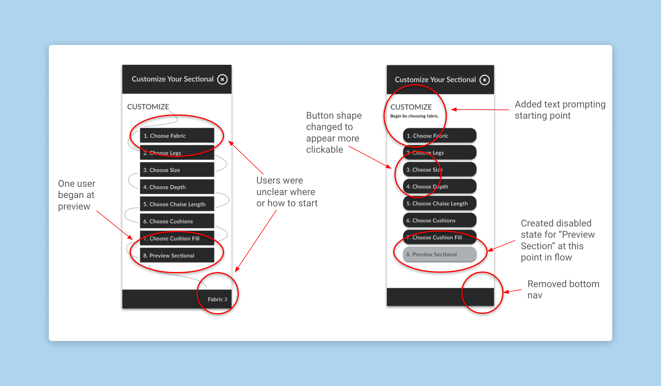
Changes made on round two:
- That people expected the Add to Cart button to be down at the bottom so we just added it so it would be in two places so that somebody could add it right away when they get to the page, or scroll down and add it next to the total
- Also users weren't seeing the edit button. So we added that down next to the total and ATC button so that they could see that more clearly
- Then also we changed up the steps page of our overlay just because some people were a little confused about where to start. – So we added some prompting up there at the top to say “customize begin by choosing fabric” and we removed the bottom CTA now so that people would see this and think “I have to click through there”
- We also made the buttons more circular, so they look more like standard buttons
Conclusion
So why stop at high quality low-fidelity wireframes?
- Color and typography might change depending on branding for each client
- Get a better understanding of the constraints we are working with
- This will be handed off to engineers of different companies, we could then assess if something was missing or if these are things that can be done?
- Is this the correct format, and then can it be built and scaled from there?
Next Steps
For our design team:
- We would want to experiment with some of our previous sketch ideas and do some further iteration and testing of the user flow
- Further iteration and testing of the UI elements, experimenting with those button styles to make sure that people really understand that's what they are, or perhaps trying some dropdowns to see if that might be more or less effective in this process
- Testing a prototype that has multiple types of furniture, so something that also might have dining sets or mattresses
For Blueport:
What would they need to make this the configurator a reality?
- High quality images
- CAD software, 3D imaging for 360 views
- Standard imaging dimensions and a database of available customizations for different furniture types.
- If those clients don't offer many options, then how can this tool still be leveraged as an opportunity for fun and trust building?
Prototype Walk-Through
Selected Works
Daily UI Challengedaily UI

Blueporte-commerce project configurator

Barner Bookse-commerce redesign
The Emily Shane Foundationwebsite redesign research
HappyPlatewebsite redesign