The Emily Shane Foundation Research
My Role:
UX Researcher
UX Design Consultant
Duration:
3 Months
Tools:
Figma
FigJam
Google Workspace
Pen and Paper
Project Overview
I was part of a four person team tasked with the research and design of a website and donation page that would support and develop the growth of The Emily Shane Foundation.
What is The Emily Shane Foundation:
Founded by the family of 13-year-old Emily Rose Shane; Emily was in 8th grade and struggled academically due to “processing issues.” Emily fell in a “grey” area; not qualifying or needing special education; yet challenged to perform to her ability. Nothing in the school system was available to address her situation.
Compelled to do more in Emily’s memory, an educational initiative was created: the SEA (Successful Educational Achievement) Program. Designed specifically for students like Emily, who “don’t fit the mold” or who risk “falling through the cracks”, a SEA student is one who is in middle school, in the mainstream classroom, and is failing and / or struggling academically.
If you want to learn more about this foundation, you can check it out here.
What are the goals of this project?
- Attract corporate partnership opportunities
- Increase brand reach & awareness
- Increase clarity around brand messaging
- Level with top competitors
- Eliminate website visitor confusion
- Make all website pages clean and uniform
- Make The SEA Program central to the brand & website
- Appeal to website visitors with engaging photos/design
- Ensure the website has a nice flow that tells a compelling story

Research Methodology:
I wanted to do a thorough analysis of The Emily Shane Foundation and used the following research methods:
- Heuristic Evaluation
- Comparative and Competitive Analysis
- User Interviews
- User Testing
- Persona
These will be discussed in greater detail below.
Heuristics Evaluation
A Heuristics Evaluation is a series of markers to measure the learnability, satisfaction, memorability, efficiency, and error management of a website. What I found was that The Emily Shane Foundation was hitting the highest severity in many categories that are important for a nonprofit website to function, and create traffic, and donations.
Initially I went through the process of doing a general audit using a heuristic evaluation of the site as it was.
There were issues surrounding memorability, and learnability of the SEA program, which is an integral part of The Emily Shane Foundation. It's unclear that the SEA program is the main focus here.
Having multiple clear ways of locating specific actions such as events, donations, and contact - affecting error management, efficiency, and satisfaction. This is listed nowhere on the site. Where do the donations go? Why donate? How does it work? - Users want to know this.
One of the biggest red flags was that there was no financial transparency anywhere on the website which directly affects users satisfaction and learnability.
Another area affecting error management, efficiency, memorability, satisfaction was no clear and easy options for donations. This includes something like optimization for apple pay, venmo, paypal that could then make the process smoother, encouraging more individual donations.
In addition, affecting satisfaction and efficiency there is no clear way to steer users towards pertinent information that can attract corporate partnership opportunities. There is no contact/indicator/path that a corporate company can follow to donate.
Lastly, there were issues surrounding error management and efficiency regarding if the interface is easy and intuitive to go through. Users kept constantly clicking outside the global navigation buttons which takes you out of the navigation, losing the userflow.
Comparative and Competitive Analysis
Next I wanted to explore some existing nonprofit organizations. I started out with competitive analysis. I looked into Big Brothers Big Sisters of American, Step Up Tutoring, and Beyond the Bell. Below are some insights from each of these websites.
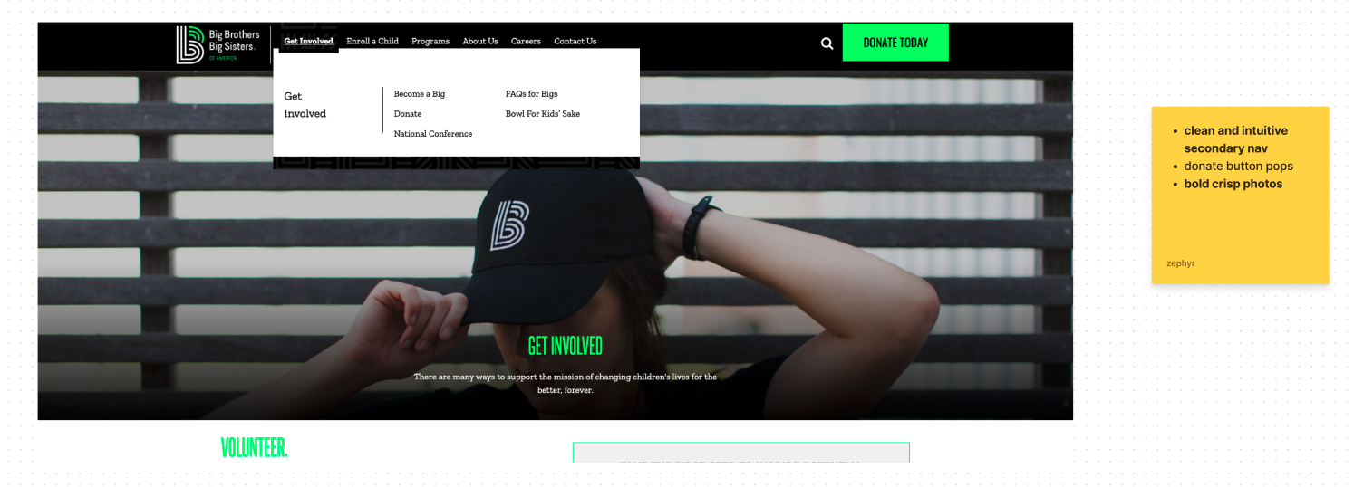
- Clean and intuitive secondary navigation
- Donate button pops
- Bold crisp photos

- Use of icons to convey information to the user
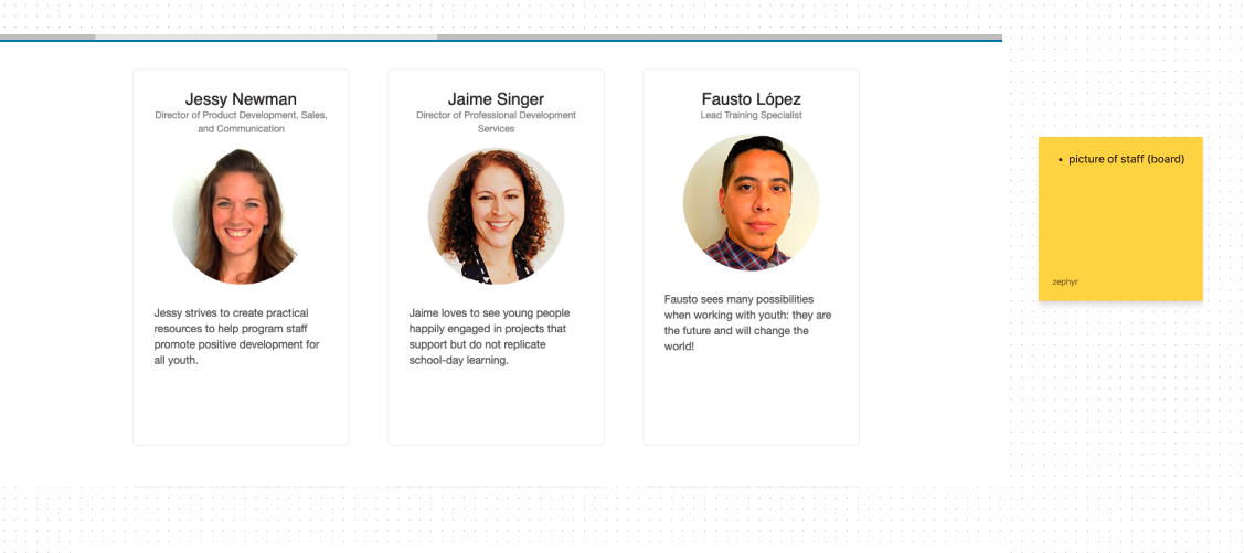
- Pictures of staff (board)
I then moved to comparative analysis. I looked into Alex’s Lemonade Stand, Digitunity, and Creative Visions. Below are some insights from each of these websites.

- Show who is donating and when
- This could be an incentive for businesses to get exposure

- Easy to navigate
- Photo placement that pulls the user in
- Clear direct copy
- Clear direct Calls To Action
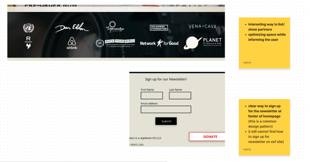
- Interesting way to list / show partners
- Optimizing space while informing the user
- Clear way to sign up for the newsletter at the footer of homepage (this is a common design pattern)
When doing this analysis I measured through doing a taskflow for each of these websites. Each one excels in the areas listed above, where The Emily Shane Foundation does not. Each of these websites has an efficient donation page, clear Calls To Action on the Landing Page, shows financial transparency, and most importantly - they cultivate trust with their appearance.
User Interviews
My main objective with user interviews was to understand individual donors / prospects' attitudes and motivations towards donating online [and when users develop caution towards online donations], as well as what considerations they have before donating to a nonprofit / organization.
I interviewed 3 users that typically donate online and / or in person. Some of the main questions that I really focused on were:
- How often do you donate [to any nonprofit or particular cause]
- Where do you donate? [types of organizations]
- What kinds of organizations do you typically donate to?
- What are your primary considerations when / before you consider donating? Why?
- Do you look for the organization's mission?
- [If you donate] Do you prefer to donate online or in person?
- What types of nonprofits / organizations would you hesitate to donate to online? Why?
- Would the appearance of the website influence your decision to donate online versus at an event for the same organization?
- When you donate online, how do you ensure that your donation will go to the intended cause?
Here are some of the direct quotes that I got after affinity mapping.

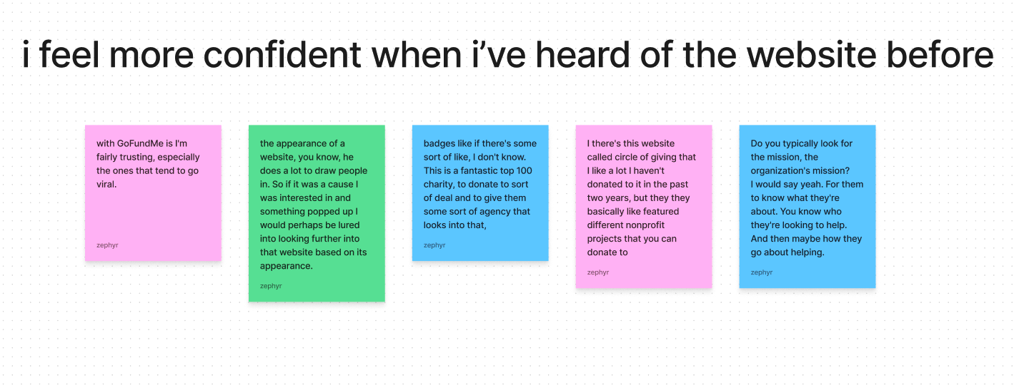
“I only donate to well known organizations I'm pretty much familiar with their mission statement and what they stand for and where the money goes.”
“I want the most, the maximum result for my donation to the best of my ability to know where those donations are going.”
“I definitely want to see that it's more inclusive and diverse organization.”
User Testing Of Existing Website
Following this initial assessment I did several generalized usability tests with 3 users of the existing website. The scenario being to find the organization's mission as well as to be able to donate. Some of the main takeaways were that users do not understand the SEA program or where it is, what it is, or that this is the main point of The Emily Shane Foundation. As well as frustrations with the website's appearance.
The following are quotes that reflect these findings:
“Just a quick glance of what's here is the various students with educational resources that they need to thrive in middle school and beyond. But that idea is sort of buried under the flower. You are like why does this charity exist or this nonprofit exists?”
“I can't understand the why. Can’t understand the mission statement or what the program actually does”
“That this is structured like this is so unsatisfying, I don't want to read this wall of text. Right? Like I need some kind of graphic there. That's pretty and like, interesting to look at.”
“There's two there's two columns of text here. Like that's confusing. What am I supposed to be reading?”
Persona Creation
After doing user interviews and user testing I created a persona to really figure out what motivates the user. What their behaviors, frustrations, and pain points might be.
Meet Staci:

Behaviors:
- Only donates to legitimate well known organizations
- Likes grants or ways to give money directly to the people who need it
- Prefers to donate online
Needs and Wants:
- Wants to be informed about what the problem is that this nonprofit is addressing
- Wants to know how much of their money is actually going towards the cause in question
Frustrations / Pain Points:
- Janky looking websites
- Large corporate nonprofit organizations
- Websites that don’t seem credible / can’t find third party mentions of the organization
- Websites that give too little information about where the funds directly go to
How might we use a website as a tool to build trust for Staci?
- accurately show how the donation funds directly impact the students
- clearly inform the user on the organizations missions, goals, and programs
- create transparency and build trust by showing how the donations directly impact the students and organization
The Problem
That then led me to defining the problem and one of the key insights that I gained is that the website appearance and financial transparency are a really great opportunity for trust building with these organizations and their users.
How might we use a website as a tool to develop transparency and trust when asking for donations.
Users need a straightforward and transparent website and donation page in order to feel confident in making a donation to a nonprofit.
Generated Artifacts
While this may not typically be part of the research stage, we wanted to give the client a tentative idea on how the navigation could be streamlined. We did this by limiting the number of global navigation, and secondary navigation options while still showcasing all the necessary information. This is reflected in the sitemap below.

Following this I also did a rough paper wireframe of the tentative homepage.

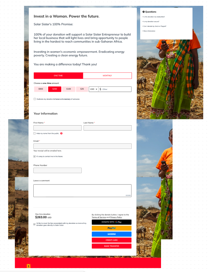
As well as give insight on what an alternative donation embed could look like. This is through GiveButter, which is a platform that could optimize and streamline the donation process.
Next Steps
- More user testing of existing website
- Create Userflows
- Move to Wireframes
- Create Prototype
- Testing of Prototype
- Iderate
Selected Works
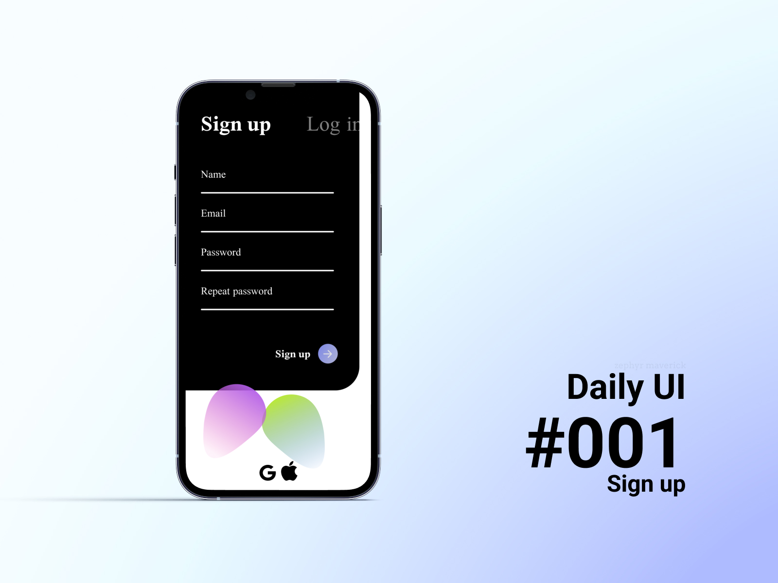
Daily UI Challengedaily UI
Blueporte-commerce project configurator

Barner Bookse-commerce redesign

The Emily Shane Foundationwebsite redesign research
HappyPlatewebsite redesign